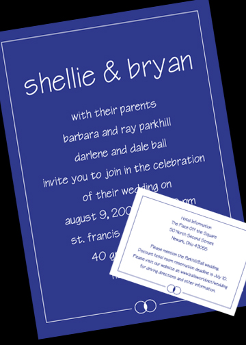
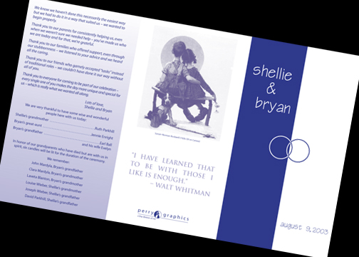
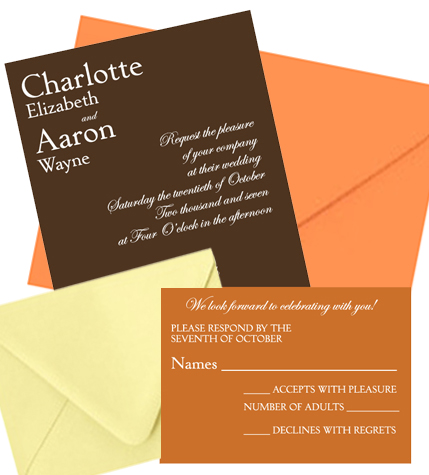
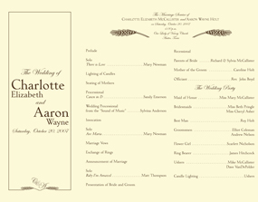
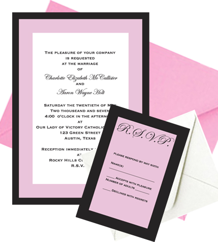
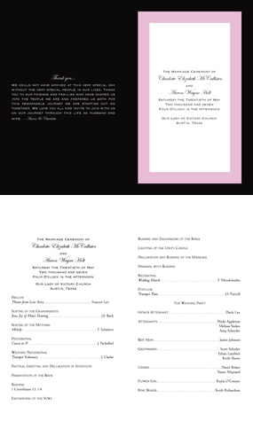
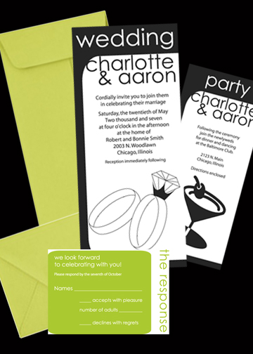
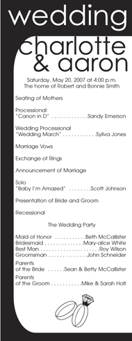
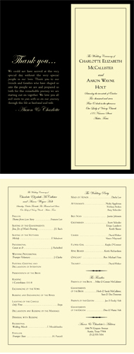
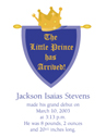
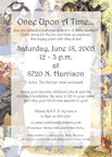
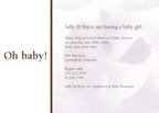
Monday, February 11, 2008
Tuesday, February 13, 2007
Thursday, November 09, 2006
Wedding Invitations
When a couple comes to me to design their wedding invitations and programs I try to have a good conversation with them to get their personalities and how they want that reflected in their wedding. Some couples want very traditional and elegant, some want classy and stylish, some just want casual and fun and I try to accommodate them all.
Purple Passion
The invitation was a basic panel card and the program was a trifold piece that fit on a legal sheet of card stock. This wedding was very casual and very much a reflection of the couple getting married. They wanted their guests to know right off that it was to be a fun celebration and they did that using their favorite color...purple!
Autumn Sophistication
Since this wedding was taking place in October, it was decided to go with autumn colors, really give the feeling of fall leaves, from the nutty, brown invitation to the pumpkin response cards. The envelopes get into the act with an ivory response envelope and wrapping it all together is a warm, sunset orange envelope. The autumn theme continued with the program, which was a trifold piece. It was printed on ivory paper stock with dark brown ink. To infuse it with the autumn feel I used wheat accents.
We All Scream for Ice Cream
Pure white response
Blossom main envelope
Ice cream kept coming to mind with this collection. It was just to be a yummy confection that was also elegant and sophisticated, with the pink and black combination. The program is a pretty straight-forward reflection of the invitation in the standard “bulletin” format.
Program-bulletin fold 8.5x11 in half
Mod
The theme for this wedding was casual and fun. The couple was going to have a martini bar at the reception so I went with that for an image to build from. I liked the tall, skinny format because it’s not overly done for weddings and since this was a unique event it called for a unique invitation. It’s capped off with chartreuse envelopes, that suggest the olives in a martini. Again I carried the look over with the program, which was a panel card that mirrored the tall, skinny invitation.
Tuxedo
This collection was to be formal and sophisticated. I was thinking of Fred Astaire movies the whole time, all smooth lines and elegance. I used a black petal enclosure envelope to set off the cream and enclose the invitation like a tuxedo jacket. I carried the look on through to the program which was a tall, vertical folded piece on the same natural-colored stock with rich black.